Curious about your journey mapping ROI? Calculate it now!
Tanya Levdikova
Tanya Levdikova is Head of Content at UXPressia, a customer experience mapping platform. A content strategist with 10+ years in B2B SaaS and tech, she leads content strategy and contributes to acquisition, product releases, and marketing automation. She also studies how companies structure their customer experience by mapping public journeys to spot gaps and missed opportunities in messaging, funnels, and lifecycle communication.

Introducing charts to customer journey maps and personas

5
(4)

Starting today, all UXPressia users with a Pro plan can build pie and bar charts right in their maps and personas. 

All you need to do is add the new chart section to your map or persona and choose a chart type you wish to use to represent your data in a visual and meaningful way.
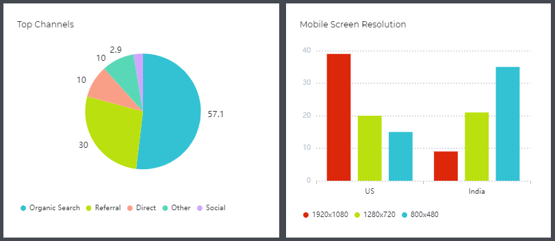
charts in uxpressia

Pie charts

Use pie charts to compare parts of a whole, such as traffic distribution by sources. And don’t forget to give your chart a name after it appears in the cell. 😉

Pie Charts in UXPressia

Bar charts

Bart charts are extremely useful when you need to compare things between different groups or track changes over time. 

Bar Charts in UXPressia

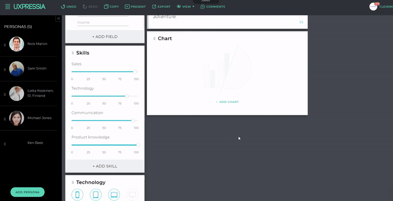
Ready to add your first chart? 

Rate this post

More posts by Tanya Levdikova
Subscribe
Notify of
guest
0 Comments
Oldest
Newest Most Voted
Inline Feedbacks
View all comments