Behavior change can be applied to product and service design to shape day-to-day experiences. Roxana Barbu, Ph.D., a Senior Cognitive and Behavioral Experience Researcher at Macadamian, a healthcare technology consultancy, equally enjoys applying behavior change principles in her work to transform others’ experiences and at home too. At our recent event, she talked about designing for behavior change, and this article summarizes the main points of her talk.
Feel free to read it or scroll down to the video recording and watch the talk instead.
Contents
The psychology of habit formation
There is a straightforward behavior change framework, which is gorgeous in its simplicity. It’s the three R model: reminder, routine, and reward.
- A reminder is that never-ending alarm that tells you what to do. It could be your phone or clock, but it could also be the voice of someone who cares deeply about you, and they just physically remind you to do something, or nag at you in a loving way.
- A routine is what happens if we follow through with the reminder. We end up repeating that behavior, forming a routine. This step is critical because repetition is key to habit formation.
- A reward could be the icing on the cake. If we are talking about changing a food-related behavior, for example, the reward could be the treat we have at the end of the week reminding us we did well. It also could be a less tangible satisfaction such as improved self esteem, better quality of life, or improved mood.
Seems simple. But this model doesn’t always work the way we would like it to. On average, it takes 66 days to change our behavior, with some people needing only 18 days, and others needing closer to a year.
When designing a product that requires someone to change their behavior, we need to keep in mind that behavior change is complex, and it is no easy task.
The journey of habit formation
It all starts with a person's motivation. When you decide to change a habit, this decision is powered either by intrinsic or extrinsic motivation. Depending on the kind of motivation, people have different behavior change journeys. Intrinsic motivation is the ideal case scenario, but in reality, not all of us have it, and it’s important to remember that.
Example: A person is just diagnosed with a medical condition and must start their treatment immediately. They have no time to cope, acknowledge, accept, and understand their diagnosis as, without treatment, the consequences could be life-threatening. In such cases, we can't wait for them to develop intrinsic motivation. But the thing is that many healthcare apps are designed for people with intrinsic motivation, not accounting for people who may not have developed this kind of motivation yet.
Once we have intrinsic motivation, we get in a loop such that reminders help us achieve a routine. Depending on how good we are at following through with the reminders, it could be easier or harder for that behavior to become automatic. This can take days or even a year, and until then, the process is challenging, associated with a high cognitive load. With enough repetition, the brain rewires itself. It’s like creating a new hiking path. The more people go through it, the more defined it becomes.
The same happens with our behavior. The more we engage in the same activity, time and time again, the more that neural pathway is engaged. So, for instance, when you become an expert driver, you no longer think of putting on your seatbelt, adjusting your mirrors, and physically turning on the car, you just do it. Automatically.
In a nutshell, habit formation depends on the habit itself, the individual’s motivation, and their unique journey to the point when an automatic habit is actually formed.
Barriers are one of the reasons why behavior change is so difficult, and sometimes these barriers lead to failure.
There are tons of barriers to changing one’s behavior. In crafting a new product, it’s crucial to take these four steps:
- Start by acknowledging that barriers exist;
- Conduct the proper research to identify those barriers;
- Address those barriers through content and design;
- Last but not least, validate that the proposed products or solutions indeed help people overcome those barriers.
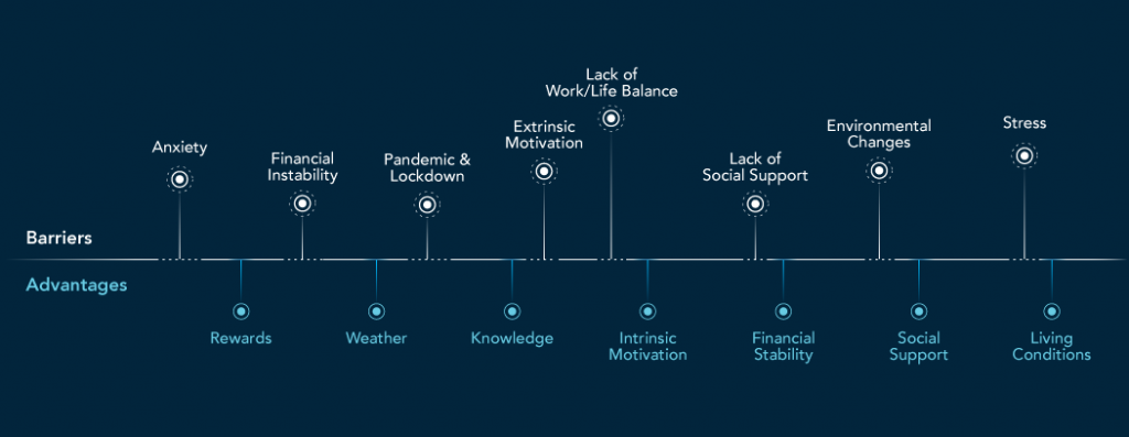
The barriers you see in the diagram above relate to people who manage their diabetes in the era of COVID-19. Some may be unique to those people, whereas others are transferable across populations and conditions.
Interconnection between the person, app, and environment
It is important to remember that products don’t exist in a vacuum. In fact, they are embedded in an intricate three-fold relationship including:
- the person;
- the app;
- and the environment.
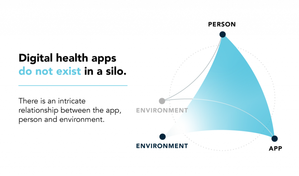
For a product to be successful, it has to account for this intricate relationship.
Example: A group of ladies living with diabetes used an app to manage their disease and get inspiration for physical activities. It worked pretty well. They went to the pool together, and aquafitness became their main physical activity. Once COVID started, the pool closed, and they couldn’t visit it anymore. The ladies went back to the app and looked at the recommendations, but there were no suitable suggestions accounting for the pandemic restrictions. The app failed to take into account the new reality and to serve and guide its consumers through the pandemic.
When we talk about journey mapping, there's a part that is often forgotten — a shared journey between the product and the person. Accounting for this shared journey can make a huge difference.

The stages of such journeys are intuitive and similar to the phases of a relationship. And just like with relationships, there’s no guarantee of a happy ending. So the Daily Usage stage may or may not be reached by someone, yet far too often professionals spend their time on the app functionalities and the value it brings to the person. If the First Date goes bad, or the Honeymoon is a disaster, who’s motivated to engage in a Long-lasting Partnership?
Regardless of how great or useful an app might be, a person needs to first be persuaded to give it a try. Furthermore, the onboarding has to go smoothly so that the person sees right away how that app is going to help them. Too many times potential consumers abandon an app during the onboarding stage, being thrown off by how much information they have to give without seeing how it’ll benefit them. So it's essential to pay close attention to all four stages as you create the product and focus on what the person may need from the app at each stage.
When you design for behavior change, be sure to stick to these guiding behavior change principles.
Thirteen behavior change principles
Behavior сhange principles:
- Can help you assess how good a product or service is. Does it have what it takes to lead to meaningful behavior change?
- Can serve as guiding principles when developing a new product from scratch.
Trust, credibility, and transparency
People hear more and more about ethical violations cases and are increasingly aware of what's happening with their data. Apps should be worthy of our trust and be transparent. It shouldn't be a mystery what data it collects from us and why.
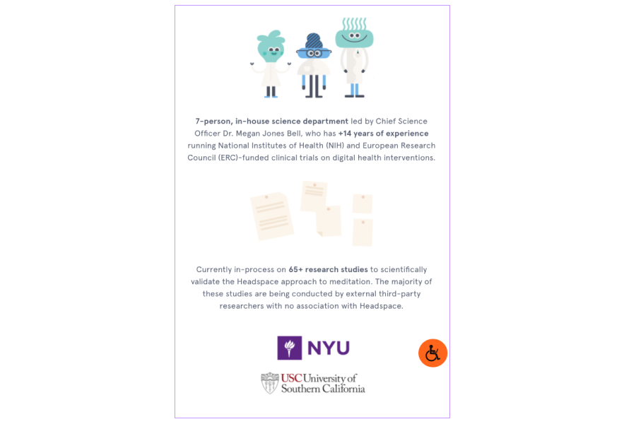
Example: Headspace is an app that teaches people how to meditate, and it differentiates itself by using a scientifically validated approach to meditation.
Motivation
Why do people use an app in the first place? What is their true “why”? The app should uncover a person’s true “why” early on, and consider their motivation along the entire journey. It is important that the app captures the distinction between intrinsic and extrinsic motivation. After all, people with extrinsic motivation respond to very different kinds of cognitive techniques than people with intrinsic motivation.
Example: Noom is an app that uses a psychology-based approach to influence eating habits.
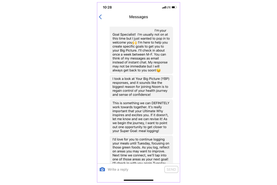
It asks people about their super goals. And often, when someone asks you something like that, the first answer is a bit superficial. Why do you want to lose weight? To look gorgeous at the party or lose 5 kilos. It’s an instinctual answer, a one-time goal.
But then Noon keeps on diving to uncover the ultimate goal, the reasoning behind the super goal. For example, you may want to lose weight to feel better in your skin. This ultimate “why” rooted in intrinsic motivation can excite and inspire us. So the app can embed it into tasks, motivational quotes, and so on, to strengthen the person's intrinsic motivation. For an in-depth discussion, see Ch. 3 in Amy Bucher’s Engaged: Designing for Behaviour Change.
Tip: One way to uncover the ultimate “why” is to conduct customer interviews using the question laddering technique, also known as five whys. You can embed this method into your product as deeper thinking will help you unleash people’s ultimate goals.
Individualization
We want apps to be personalized to us. So our ask for the app is whether it knows us and our needs. People differ in their motivations, risk profiles, starting points, attitudes, preferences, and more. So apps should identify these differences and provide us options tailored to our unique set of needs.
Example: The Balance app is a personalized meditation app. During onboarding, it learns how experienced the person is with meditation, or at what point in their meditation journey they are at.
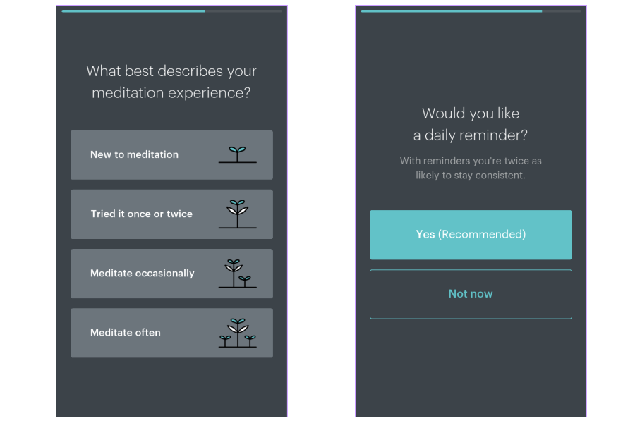
There’s no surprise that where someone is at in their journey impacts the level of support they need. It can also influence how prevalent the education component may be in the app and so on. Understanding someone’s starting point can help create a personalized experience.
Education
The educational component is huge, particularly in the healthcare domain. For example, people with a new diagnosis need time to understand the information and how the goals in the app relate to their outcome and wellbeing. So apps should equip them with the knowledge they need. It serves two purposes:
- When a person uses an app, they need to understand how the tasks / goals within the app benefit them.
- Knowledge helps people shift their attitudes towards behavior change and helps them advance along in their journey.
Example: MyFitnessPal tracks diet and exercise. It provides educational snippets about the food and food entries, which can influence future decisions.
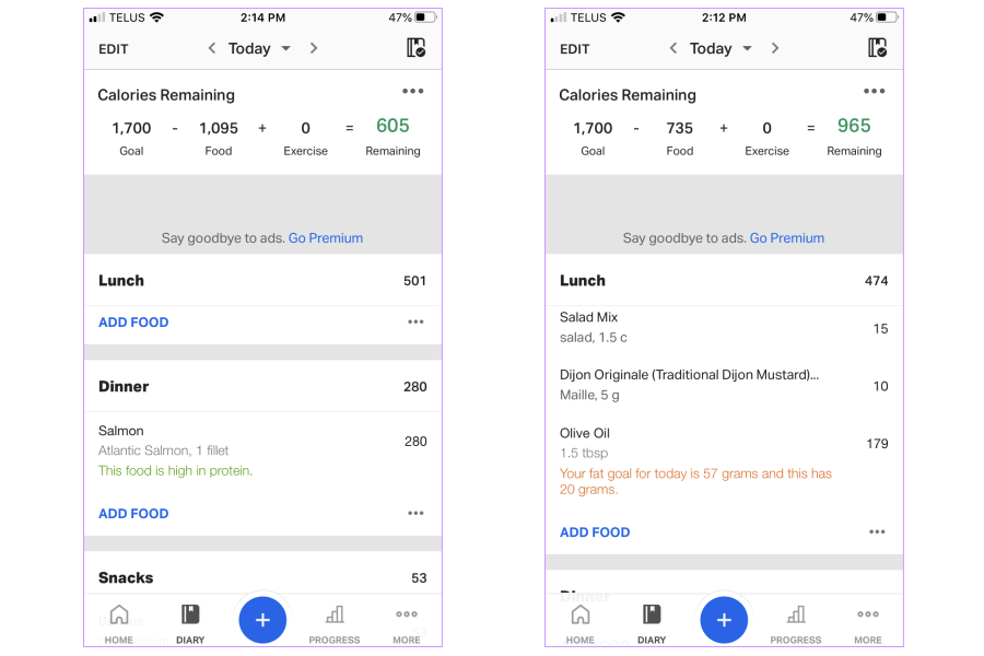
It uses two colors to indicate the positive or negative direction. And it can stick with you. Next time in the restaurant, you may choose salmon because the app marked it as a good choice. It’s more powerful than just thinking in terms of the grams and calories. That snippet of knowledge influences your future actions, whether you are dining out or grocery shopping.
Goal setting and revising
As we engage in a new activity, we need goals to guide us to the outcome. And usually, apps present people with a goal list to choose from. However, sometimes these goals are not related to the outcome, or if they are, it is not obvious. The QuitNow app provides an example of how things are done right.
Example: The QuitNow app engages people to quit smoking. And it has about 70 goals or so that you can track: days quit, dollars saved, cigarettes avoided, time won back, and so on.
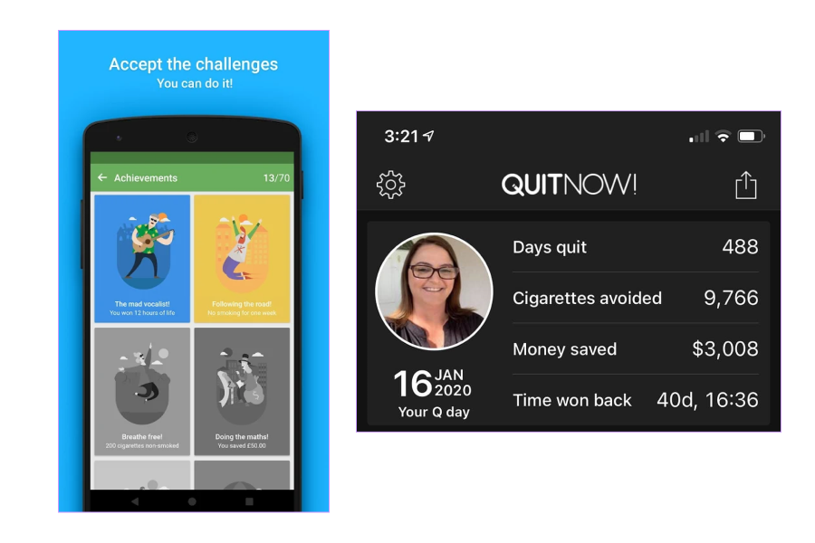
And these goals are a nice mixture of things related to both intrinsic and extrinsic motivation. For instance, many people want to quit because smoking is an expensive habit—Money saved is their extrinsic motivation. Time won back or Days quit speak to people's intrinsic motivations. And it’s really important for goals to account for both.
Feedback
Whenever we have goals, we also need feedback to understand whether we’re on track. People should understand their progress and receive clear and actionable guidance as to what to do next. Bad feedback is like a bad teacher returning your essay that you failed miserably. Except there's absolutely nothing red on the page, and you have no idea what to do to fix it. If you get feedback, you should know what to do to make it better next time. And there should be a clear relationship between the feedback and your goal.
Example: The Garmin Connect app tells you kilometers run but has the extra element: the social comparison.
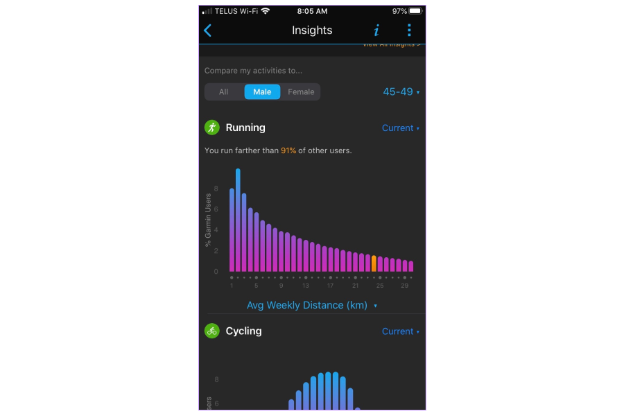
It tells you how you are doing relative to other people in the same area. That serves as an incentive for behavior change.
Reminders
Reminders are key to forming a new habit, and effective reminders should be much more than alarms.
Example: Noom personalizes reminders to the person’s schedule.
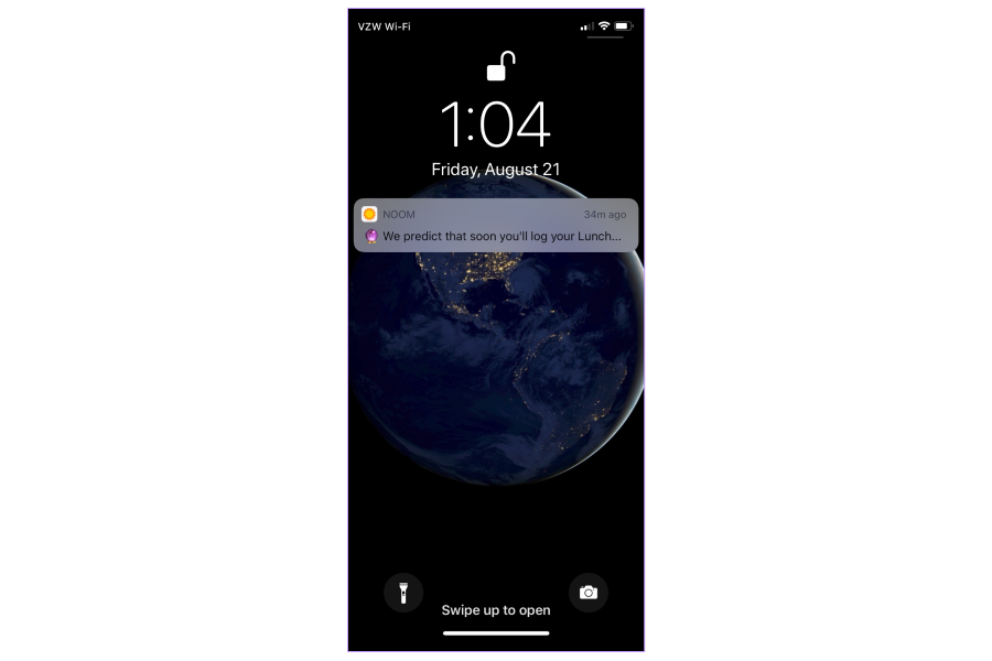
So it has that extra level of accounting for your own routine.
Engagement mechanisms
The app should prompt people to adopt the product and keep them engaged until they accomplish their goal. To do so, engagement mechanisms should consider the person's motivation and be rooted in the psychology of habit formation and consistent with cognitive neuroscience findings. It’s not enough for an app to have a reward functionality. Neuroscience studies teach us that it’s not the reward itself that leads to the release of dopamine, it's the anticipation of the reward. So the app should account for that.
Example: LifeWorks provides a journaling option. It's a very established cognitive behavior technique.
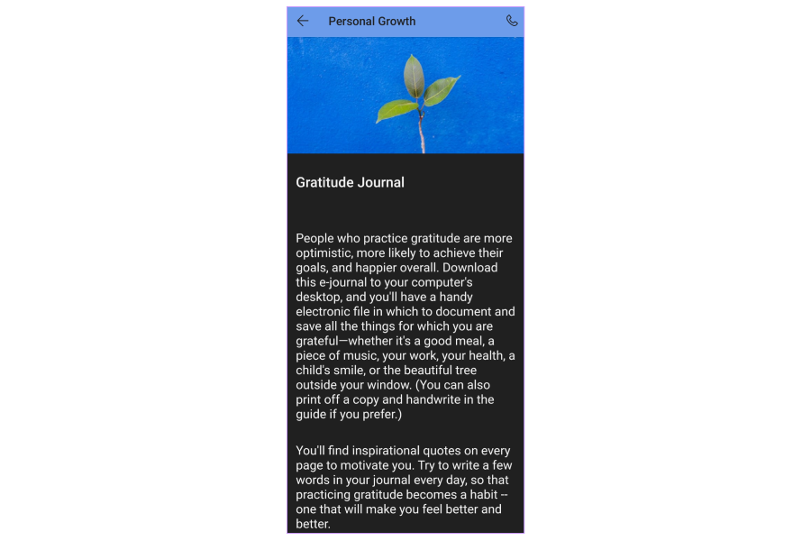
It’s a very uncommon but very powerful engagement mechanism.
Aesthetic experience
Aesthetic experience does matter, and it starts mattering as early as the pre-onboarding stage. The theme and tone of the app should provide people with a sense of place, giving them a satisfying, inviting, approachable, and meaningful experience. The choice of colors, imagery, and tone should all match the intent of the app.
Example: MySugr, a management diabetes app, uses humor to make content stick.
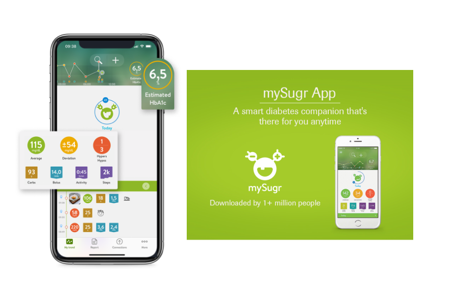
It has a diabetes monster that kind of jumps around and jokes. Some people love it, while others consider it a mockery. That's where personalization comes into play.
Human connection
The human connection is probably the most intuitive principle. We all have a need for it, which could be met by connecting with others and directly learning from their stories. But the critical point is that we can have human connections without digitally connecting to other people.
Example: Noon, just as you start, tells you how many other people are successful through their app.
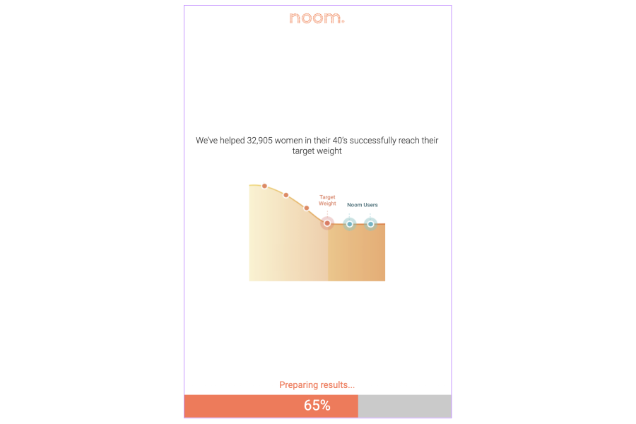
So, all of a sudden, you feel part of a much larger community without actually knowing or being digitally connected to those people. And that’s great because not everyone wants that extra digital connection.
Relevance
Relevance is about how the app's offerings tie into and are conducive towards people's goals.
Example: The Mindshift app helps people with anxiety.
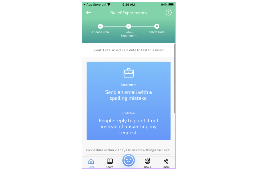
It asks people to send an email with a spelling mistake. It provides guidance, exercises, and individualized plans to cope with anxiety, but you can also take it outside and practice anywhere. So you can repeat that in the absence of the app.
Transcendence and empowerment
Transcendence and empowerment are about what comes next, after we've reached our goal. One way that the app can keep people engaged is to equip them with the tools they need to maintain the habit after they leave the app. Or it can continue fostering social relationships, satisfy their needs of feeling good, or empower them to move from being learners to mentors or contributors.
Example: Clue Plus is a period-related app that allows you to continue contributing to science.
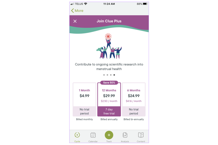
“You subscription funds research the world desperately needs. Scientists don’t know much about the menstrual cycle, but Clue is trying to change that. We fund research and support studies to make menstrual health topics less taboo and more mainstream. We ensure that Clue data is anonymized in clinical trials and used exclusively by top menstrual health researchers around the world. With the money from Clue Plus subscriptions, we’ve been able to help researchers and scientists in the field make many discoveries that have been published in scientific journals.
You may sign up because you have irregular periods, but just the motivation of continuing to contribute to science is enough to keep some people engaged.
Person-app-environment loop
It’s about the intricate relationship between the three and how the app should account for changes in people’s needs but also changes in their environments. Additionally, the app should empower people to take advantage of their environment to support them in their behavior change quest.
Example: The Fabulous app helps people build new habits.
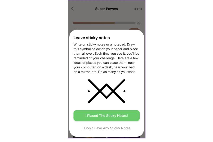
It tells you to put sticky notes around your house. And then the reminder is no longer coming from the app but from your mirror, your living room, your kitchen, and so on. So now all of these reminders for good behavior are in your living space, not in the app itself.
Key takeaways
- The 3R model is just the beginning.
- Behavior change is complex, and you can't form a habit in a silo.
- True habit formation is not app-dependent.
- The app needs more than usability alone to lead to meaningful change.
- When you design for behavior change, you need to take behavior change principles into account.
The recording
Even if you’ve read up to this point, press the play button for the great narration by Roxana Barbu herself. The video contains more details about designing for behavior change, examples of the behavior change principles implementation, and the Q&A session where you will learn why gamification is not the best hook for the healthcare digital app and other insights.


