When it comes to customer experience, the first interaction matters a lot. And it can happen way before the client even touches the product or service your offer. For example, when they see an online ad promoting your product.
That’s something to keep in mind when running any business, no matter whether it is online or offline. Website owners (especially those offering a SaaS product) might be tempted to think only about the technical side of their product. But they should also focus on the user experience they deliver at different stages of your user journey.
When it comes to customer experience, the first interaction matters a lot. And it can happen way before the client even touches the product or service you offer. For example, when they see an online ad promoting your product.
That’s something to keep in mind when running any business, no matter whether it is online or offline. Website owners (especially those offering a SaaS product) might be tempted to think only about the technical side of their product. But they should also focus on the user experience they deliver at different stages of your user journey.
To understand what your company website visitors are stressed about and know what problems may exist before a visitor even faces them and come up with ideas on how to improve their experience, as well as your website and product, you can start with creating a user journey map for your website, detailing the steps your user takes and even mapping out their emotional journey.
A quality journey map can help plan out user-friendly navigation from initial research to post-purchase needs, convert a lead to a customer, and increase customer loyalty by getting a +1 brand advocate.
To provide you with some guidance on building a customer map for a website, we’ll follow in the footsteps of Mike Wojcik, a product marketing manager looking for an IT solution for his company and his website journey. This customer journey map outlines the stages Mike goes through, focusing on Mike’s actions and emotions during the interaction with the website of a SaaS company — DemoFilm.
So, what does Mike’s journey look like? Read on to find it out, or scroll down to watch the video about it.
Contents
Before actually creating a journey map for a website
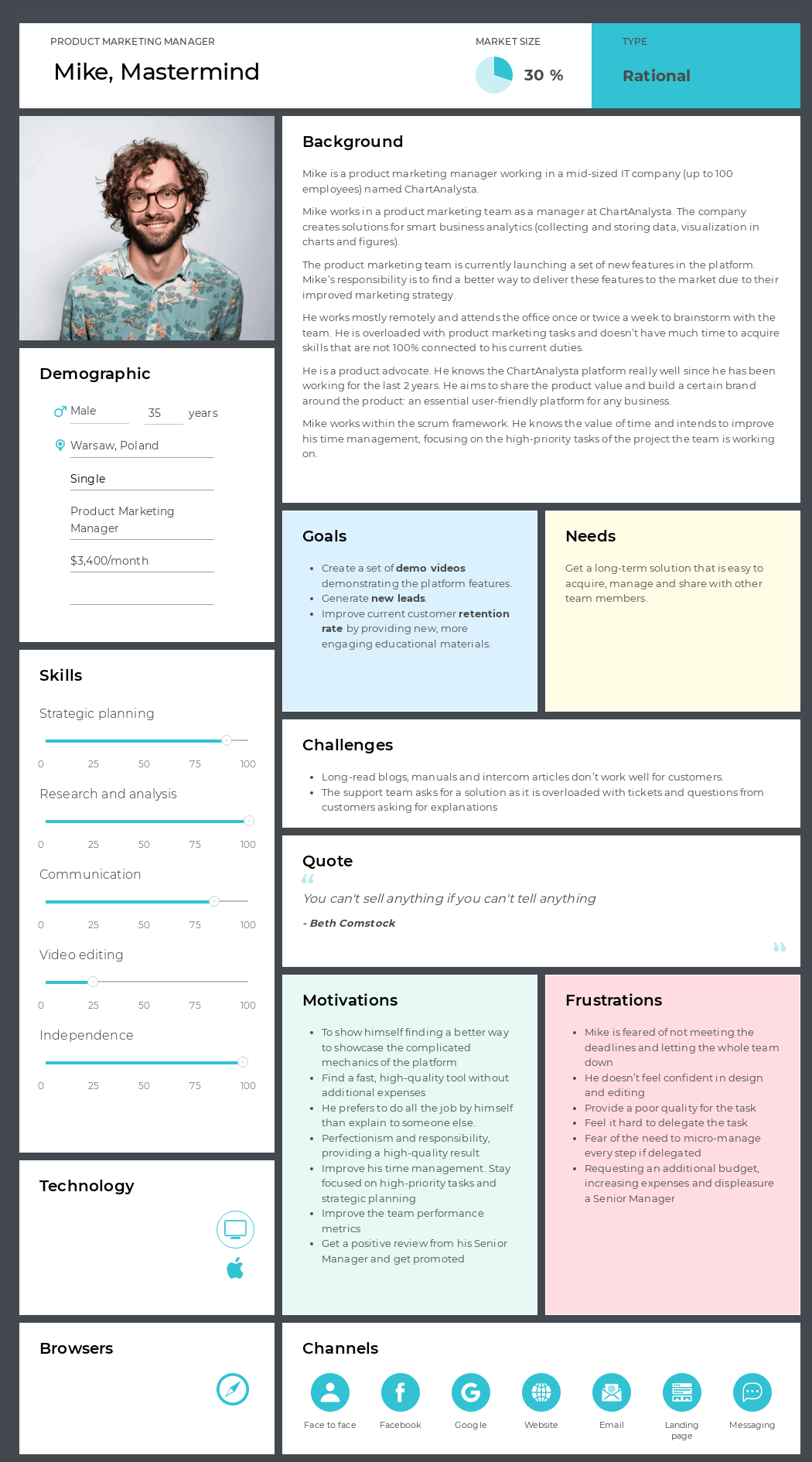
Create your persona(s) first. The protagonist of this journey map is Mike Wojcik, a product marketing manager at ChartAnalysta. The company develops solutions to visualize statistical data in charts and figures.
The product marketing team is launching new features in the platform. Mike is searching for an easy-to-use solution to create product demo videos of the ChartAnalysta platform and deliver the product value to their leads and customers more efficiently.
Mike’s personal and professional goal is to grow his time-management skills. He prefers to work independently and is a perfectionist and a science geek. He isn’t quite familiar with classical video editing tools. Being a SaaS worker himself, Mike believes that a good SaaS service is worth using. Thus, he is looking for software that could do all the monkey jobs for him and one he could manage easily.
Sections
After outlining your buyer persona (learn more about how to create a buyer persona in our Step-By-Step Guide), decide on the sections to add to the journey map.
In the map we built for this article, we used 7 sections of UXPressia’s CJM Tool:
- Goals – to understand Mike’s goals and think of how to help him achieve those goals;
- Action points – to get a full picture of what the user does at each stage and plan out any possible user interactions with your website;
- Problems – to find out existing experience flaws;
- Ideas – to spot opportunities for future improvements;
- Process and channels – to visualize Mike’s path through different channels;
- Experience – to illustrate the user’s emotional journey;
- Image — to explain things visually:
After defining the sections, think of the stages of the map. In our example, we divided Mike’s journey into 12 stages. This website user journey map template can work to spot ideas for improving your current web pages and foresee the pitfalls in the prospective website UX. Note that UXPressia’s templates are 100% flexible. You can remove, move around, or add custom sections depending on your specific business needs.
Website visitor journey stages
Let’s look at the possible stages of a website visitor journey. Ready to learn Mike’s story?
Phase 0: Get aware & Search
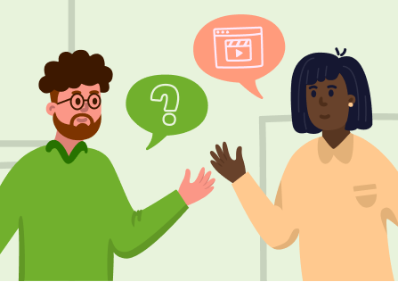
Every customer journey starts with understanding a problem and an intent to find a solution. Mike comes up with the idea to use a software solution instead of hiring a video editor or urgently learning to edit videos himself after discussing the problem with his teammates at a work meeting. This is where the initial search starts. Your future website visitor can be searching through multiple channels at a time, so it’s a point to plan out your digital presence and improve the brand’s share of voice.
At the stage of the search, just like any average user, Mike visits and compares various websites, learns the basics about the solution itself, and decides on choosing a software OR gets back to his initial plan (hire a person to do video editing or do it all by himself).
1.1 Main page
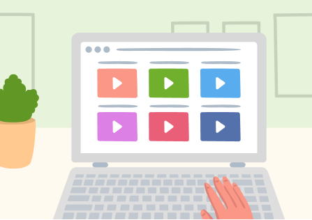
In most cases, the main website page will be the first touchpoint for your future customers. They likely have already reviewed a couple of websites and don't want to spend another 20 minutes examining each and every detail of your software. Remember that you never get a second chance to make a first impression. When visiting the website, Mike wants to get a quick answer to the question, “Can this software solve my problem?”. Optimize your main page or landing page to make it transparent and provide the value clearly and briefly.
1.2 Product tour + Subscription plan
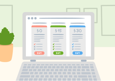
It’s time to show what’s under the bonnet of your software and how it overcomes the competitors, but remember not to delve much into technical details. It would be great to merge this page with the pricing plan page so that users have a clear understanding of how much they pay for an actual set of features and don't need to get back and forth between two pages.
1.3 Demo request
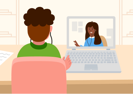
Mike is impressed with the DemoFilm software and sees the platform with his own eyes. However, he can’t just quickly get access. Instead, he has to leave a demo request and wait for the sales manager to contact him to schedule a demo call demonstration. While a guided demo and a call with a sales representative definitely have their perks, this step can be a huge obstacle for a visitor. Think of providing an option to try your platform and schedule a meeting afterward. Integrate a live chat with a sales manager to remove this limitation.
1.4 Free trial
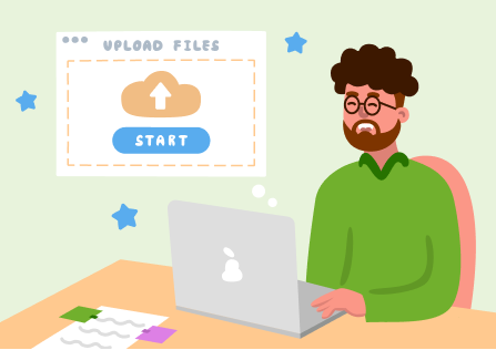
After a demo call with sales and a little help choosing the plan, Mike is ready for his free trial. He is full of enthusiasm but also a little bit nervous as he has never created a demo video before. The free period is a double-sided coin. We all love freebies, but the frustration comes when the grace period is over. Mike feels really great about using the software, but he is anxious to miss the end of the period and get withdrawn automatically. Make sure you provide clear instructions for this flow on your website. Think of adding automatic notifications or a countdown. And, of course, state it all out clearly about payment options.
The user’s journey doesn’t end with a purchase. A SaaS user usually keeps interacting with a website, using it as an entry point to the software. If your business only provides downloadable desktop software, you can still think of your website optimization for users’ post-purchase needs, like support, education, troubleshooting, learning for the new updates, etc.
2.1 Additional service
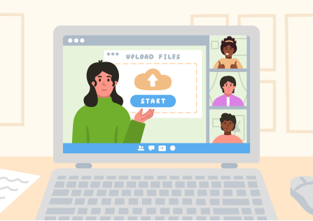
You can think of introducing some add-ons at this stage. Tell more about the additional services or enterprise offers before visitors proceed to payment. Mike got interested in corporate onboarding and added this service to his final billing. Just like at the previous stage, make sure you deliver this information clearly.
2.2 Billing form
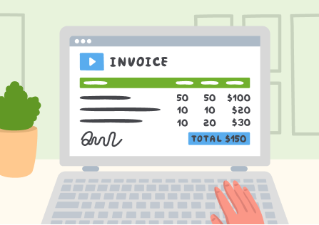
Your crucial milestone is almost reached, so it’s important it goes without a hitch. Design a 1-2 click payment solution, shareable payment links, and auto-billing within the same webpage. And no PDFs or additional emails to share with an accountant, please!
2.3 Platform login + Support & Intercom
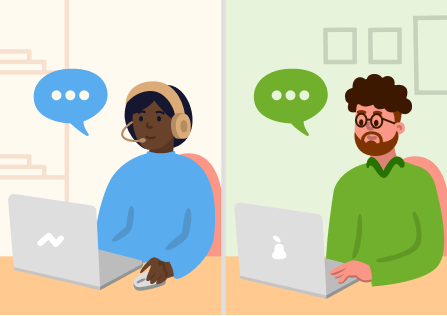
After paying for the service, Mike can’t wait to proceed to his job task and create his first demo video. However, he still experiences issues with creating accounts for his teammates and has to waste his time interacting with customer success and technical support in emails, intercom messages, and on the phone. Mike also faces some trouble figuring out how to use one of the platform features. He contacts support but only receives the links to long-read articles that require a lot of time to find the answer.
A good tip here: plan out one means of communication on your website. Adding an intercom (or similar) service can improve the customer experience, even if they face some trouble with your service. Plan out some basic answers, but never underestimate the power of personal communication.
2.4 Feedback

A satisfied customer or website visitor is the best business strategy of all. Design a questionnaire to collect customer feedback and, once in a while, send push-up notifications asking the customers to share their experiences. Don’t be too pushy or include too many open questions. A happy customer will tell more in his own words if he really wants to. Respect privacy, as not everyone likes their messages to be shared in public. Design a customer review section on your website’s main page to showcase the best customer experience and grow your business liability.
Website visitor journey map
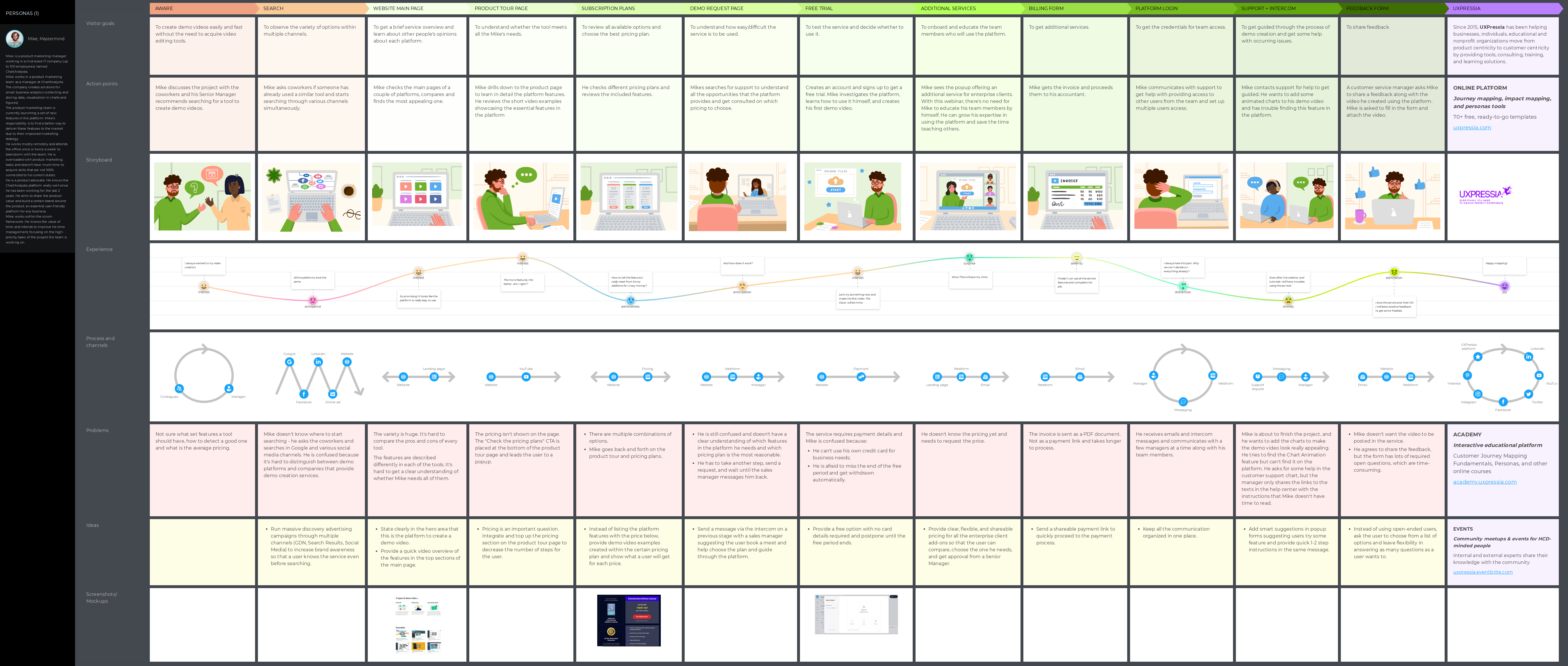
Combining all the stages, you will end up with a detailed journey map ready for further ideation process, precise website visitor tracking, and improvement of your visitors' experience. Mike's journey looks like this:
Ready to build your own website customer journey map and improve your website traffic? Take the first step using the template and a detailed customer journey experience with the help of the UXPressia template.
The video
Prefer watching to reading? Check out our YouTube video with Mike's story.
