As we continue the series of blog posts based on our events with guest speakers, our warm welcome today goes to Jennifer Clinehens, the author of Choice Hacking and CX That Sings. Throughout her career, she has helped brands like McDonald's, AT&T, Adidas, and many others craft unique customer experiences. She is currently working as the Head of Experience at a marketing store, and today Jennifer is sharing her knowledge of behavioral science principles and their power to shape customer journeys.
Contents
What is behavioral science?
Let’s start with the basics and define what behavioral science really is, as there is a lot of confusion around the term. The general definition is that behavioral science is the study of why people make (and act on) the decisions that they do.
Behavioral science is an umbrella term that encompasses principles from behavioral economics, psychology, neuromarketing, cognitive science, etc. That’s why it’s important to take what’s useful and discard the rest.
Quite often people do not really understand the whole picture of what is motivating them. There is a cognitive bias called narrative bias. We have a tendency to put together a story describing the chain of events, but in reality we don't know why we did what we did.
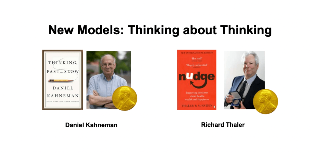
Nobel Prize winners Daniel Kahneman and Richard Thaler are the founding fathers of behavioral science. In his book, Thinking, Fast and Slow, Daniel Kahneman moved people from thinking about thinking as the conscious process to thinking about it as the unconscious one. In marketing, there is the AIDA model according to which we have to grab someone's attention, pique their interest, stoke their desire, and then move them to action. But thanks to Kahneman’s research, we know that most of our decisions are not made that way as they are unconscious.
One of the factors that drive our unconscious decisions can be fame, and Starbucks is a perfect example of that. If there is a Starbucks on the street corner, you are more likely to go there because you know Starbucks, its reputation. People talk about it, and people you know go there.
Other factors include saliency — if something pops from the background and becomes noticeable. Emotion and recognition are also key for customer journey mapping. Customers go through an emotional journey with ups and downs. And traditionally we use that to guide us in creating and improving their experience. But there are moments in the emotional journey that punch above their weight.
The second founding father, Richard Thaler, describes the power of a nudge to affect our choices. A nudge can be defined as a motivation with an indirect suggestion. The idea is that how you present a choice, which is called choice architecture, will influence what people do.
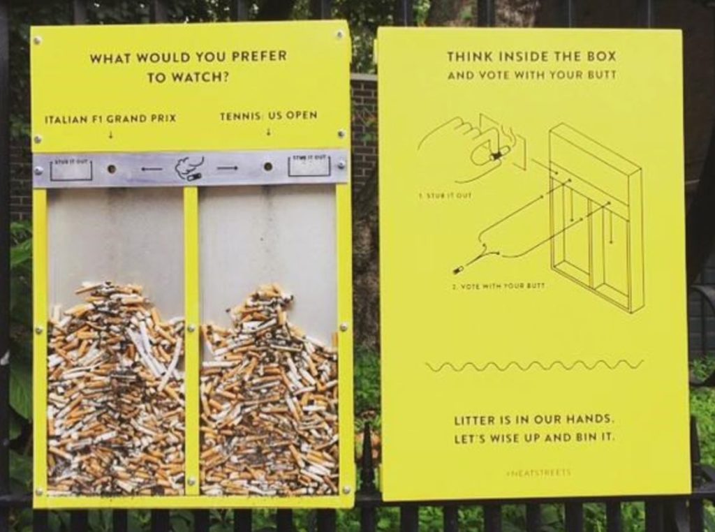
Here’s an interesting example of a nudge. To solve the problem with people smoking and throwing cigarette butts on the ground, the city of Boston decided to put up bins with two transparent compartments, asking people to vote for Tennis US Open or Formula 1 Grand Prix by putting butts on the right-hand side or left-hand side respectively. The interesting thing is that as choice architects, we don’t care whether they want to watch tennis or Grand Prix. What we care about is that there are no more butts on the ground.
Key behavioral science principles and how to apply them to journey mapping
There are four basic principles that can help you better shape your customer journeys. Let’s have a better look at them.
People don’t like to think
To understand this concept, we first need to circle back to the cognitive and heuristic biases. Basically, a cognitive bias is a systematic error in thinking. Everyone is susceptible to these biases, no matter their age, gender, or cultural background. We will rely on cognitive biases even more when we are in a hurry, when we feel social pressure, or when we are more emotional. However, everyday thinking and decision-making are subject to cognitive biases as well.
And for us, UX designers, knowing about those biases and the moments when they come into play is what helps us get a better picture of why people are making the decisions they make.
Heuristics are mental shortcuts that allow people to make decisions without thinking too hard. Daniel Kahneman puts it perfectly:
“Thinking is to humans what swimming is to cats; they can do it but they’d prefer not to.”
This is a great guiding principle for UX designers: not to make assumptions that people want to deeply engage with stuff as most of the time they don’t. That’s why it’s important to keep those mental shortcuts in mind.
The halo effect
The halo effect is the tendency for people to let one positive trait guide their total opinion of a person, product, or experience. For example, people consider good-looking individuals more intelligent, more successful, and more popular. We also think that taller people are smarter.
You may wonder, how does that work for user experience? A consultancy firm did research around the idea that the halo effect can actually work with design and effectiveness. As part of their research, they showed people two login pages that were only different in color and font size.
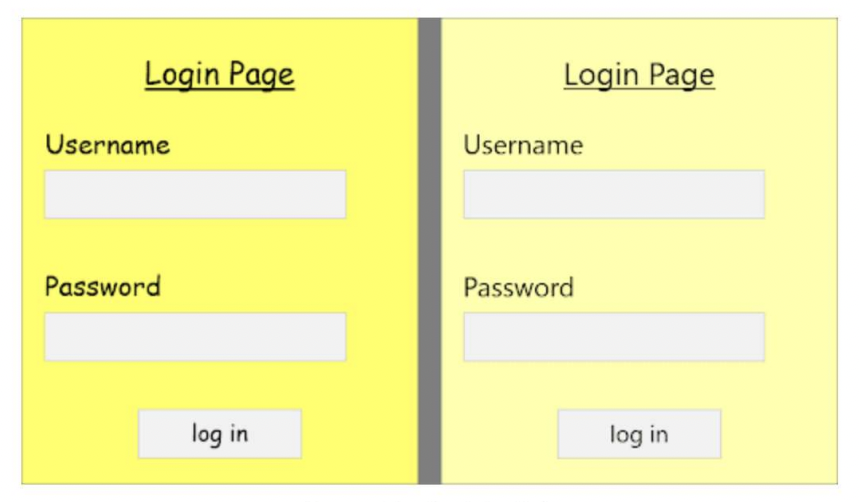
When asked which one is more attractive and aesthetically pleasing, the respondents chose the page on the right-hand side. However, both of these login page experiences were exactly the same. Trying to figure out the impact of the halo effect, the researchers asked the respondents to log in and assess page performance.
As the result of the experience, the attractive page was rated:
- 104% more reliable;
- 37% more intuitive;
- 152% more resilient to hacking.
Because of the halo effect, people assumed that the attractive page was more effective and secure, despite the fact that the experience was identical.
Getting back to a customer journey, we need to find those moments where customers slow down or drop off. It's usually an indicator that you are making people think too hard and not presenting options, information, and products in an easy-to-digest way.
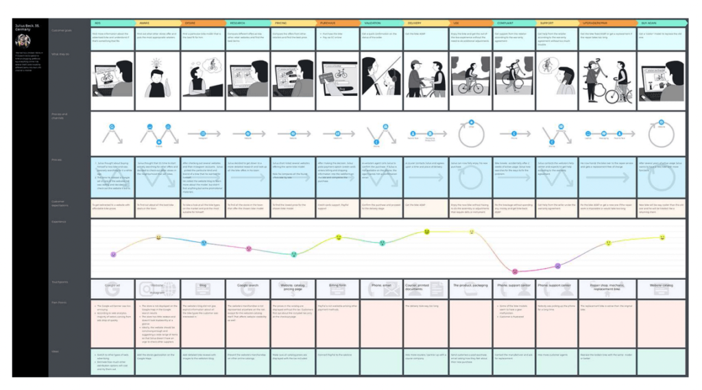
Product comparison and support are the moments you need to look at more closely. If you present too many options, are your customers able to compare your products in a quick and easy way? The support process, too, can be overwhelming.
We are influenced by context much more than we realize
The great behavioral science principle around this is priming. First demonstrated in the 1970s, priming is when our brains call on unconscious connections in response to a stimulus (also called primes). In other words, what we’re exposed to now changes our behavior later.
For example, one research showed that if a football team has red jerseys, they get more penalties — all because we are primed to think that red is an aggressive color, so teams in red must be violating the rules more. However, different studies show that it’s not true.
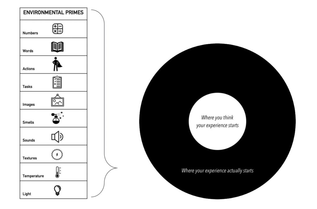
Priming is passive, subtle, and people aren’t aware it’s happening. And it can be activated with almost any kind of stimulus — images, words, tasks, smells, light, sound, touch, or temperature can all unconsciously affect our choices.
Another example shows us how priming works through the press. When Brexit happened, the Marmite brand had a disagreement with Tesco, a multinational retailer. Due to their spat, Marmite’s reputation declined by 11.6 points, and purchase intent dropped -3.9 points. But because of the press generated by Marmite’s public fight with Tesco, sales of Marmite increased by 61%. That’s basically a vivid demonstration that no press is bad press.
When doing a customer journey map, how can we find those moments that might be key for priming? Looking at customer experiences, we often think that we know where they start and end. If a customer is standing in a queue, then they have a queue experience. In reality, there is so much more happening before and around that specific moment in time. And that's where priming can come in.
There are different sorts of environmental primes that can be used even before a certain experience starts. You can pump in the smell of fresh grass if you sell trainers. Images, sounds, smells, textures — anything can be used for priming.
Once you've put the map together and found those key moments, make sure to take a look at them and then go back a little bit to prime customers even better in those moments. Behavioral science is not a silver bullet that will help you convert 100% customers, but even a 5% boost in the conversion rate will pay for your efforts.
Choice architecture often makes our choices for us
Talking about choice, we need to start with the concept of default. Defaults are pre-set choices that take effect if a customer does nothing. And studies have shown that people rarely change the default settings. Microsoft found that 95% of people kept all default settings, even for critical features like autosave.
In terms of designing a customer experience, you need to identify the moments of decision and experiment with choice architecture. Experimentation here is key. It’s a cost-effective way to find out if there is a better way to present options. Try asking yourself if there’s anything you can change to better guide customers.
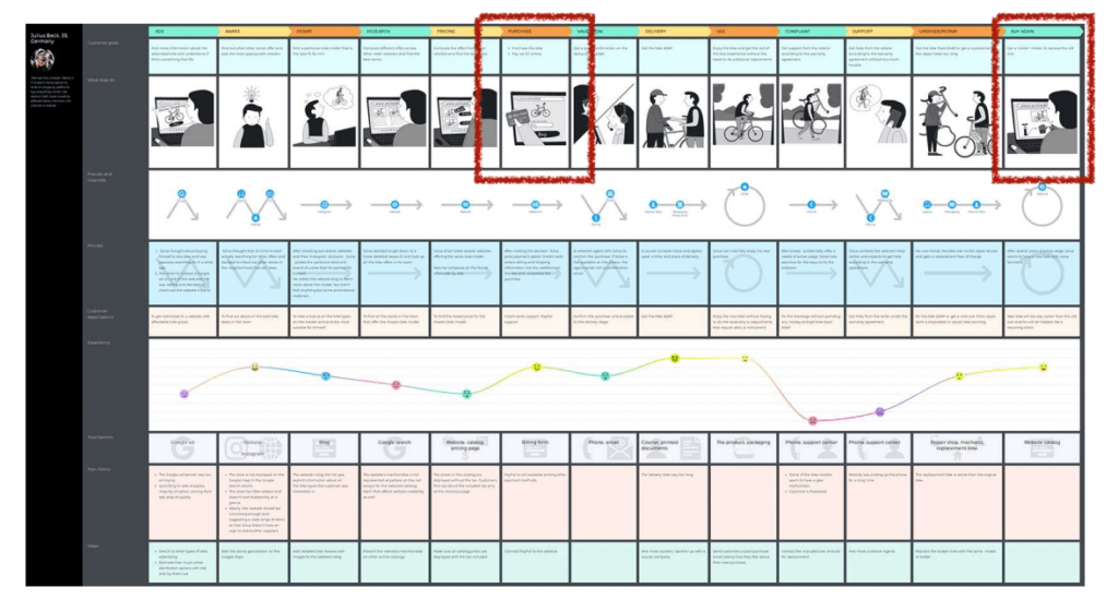
People create memories and judgments of an experience based on only two moments in the journey
The behavioral science principle behind this is called the peak-end rule. This is a psychological principle that says that people judge an experience based on how they felt at its peak and its end, not the average of every moment of the experience. Whether it’s a terrible experience or a great one, people tend to remember the most salient parts.
Here’s a journey map for a drive-up service to demonstrate the peak-end principle in action.
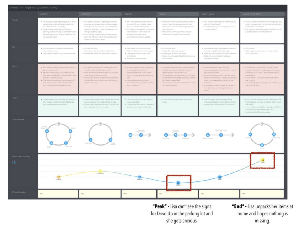
The lowest peak for Lisa, our persona, was when she couldn’t see the signs and didn’t know where to park as it was her first drive-up experience, which resulted in her getting nervous and anxious. The end was the unpacking part, where Lisa found that nothing was missing. Lisa’s average experience can be described as so-so, but had we fixed that one part — make the signs bigger, for instance — the average experience would have been much better, and the C-SAT score and NPS would have gone up in a disproportionate way.
In the real world, this principle helps companies to effectively use their budget and get better ROI. Even spending 50% of the budget on improving these two points will get you far down the road.
Quick summary
When building a journey map, make sure that you are matching objectives, intent and behavioral science principles, and every phase of the journey.
Here’s an example of a purchase journey and how behavioral principles can be applied in practice. If we are in the need and awareness stage, maybe we should manage the experience that precedes and pull on certain behavioral principles for that purpose. For example, prime customers with different smells.
If we are at the research and consideration stage, we may design a better choice architecture and streamline options. And since we are talking about a purchase journey, we obviously want to motivate action. That’s where you can frame communication in order to nudge people in the right direction. It may be about making our information stand out or removing the pain of payment by applying the cashless effect.

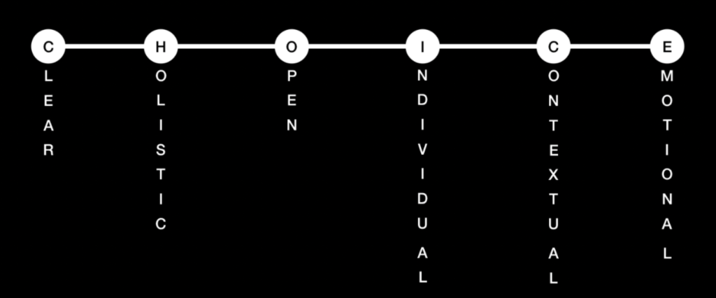
A pro tip here is to have a holistic behavioral science framework that you can use to audit and design your customer journey. Here’s one example of such a framework that is based on best practices from top companies like Disney, Netflix, Uber, etc. From a behavioral science perspective, all their experiences have six things in common — they are easy to understand, holistic, transparent, personalized, contextual, and emotional.
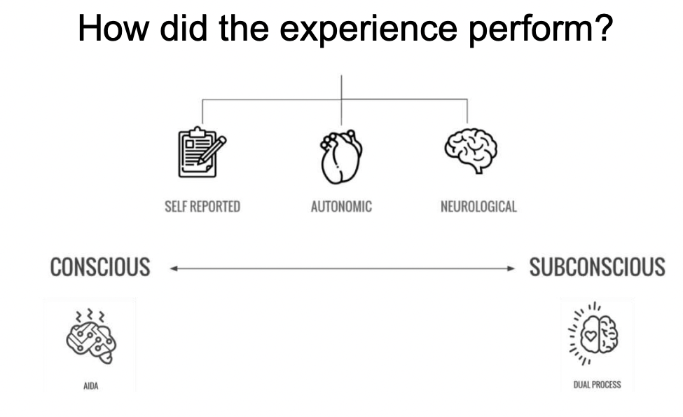
And lastly, make sure that you are matching metrics in the map and measuring what people do — and not just what they say they do. In the real world, it is really difficult to do completely neurological and autonomic research. You still have to rely on self-reported research, but remember that with this type of research you’ll have a narrative bias when people are trying to stitch up a story about why they did this or that.
Why apply behavioral science to customer experience?
- Make your journey improvements stronger. Use behavioral science principles to find the key moments in the experience, particularly the emotional journey, that punch above their weight.
- Recognize invisible barriers. Behavioral science helps you get under the skin of why customers might be doing what they’re doing. By looking at the context of decisions, you can spot places where the environment is driving the “wrong” behavior.
- Drive customer choice. When you use behavioral science, you increase the probability that customers will do what you want them to. You no longer have to rely on “gut feeling” or qualitative research to make expensive and risky decisions. Instead, you can base your approaches on proven, peer-reviewed research.
Final thoughts
When applied correctly, behavioral science principles can be very powerful, but it’s not a silver bullet. It’s also very important to have a personal moral code and use behavioral science principles only when they create value for customers. And last but not least, experimentation with these tactics is more important for business than repeatability in lab settings because things are different in the real world.

Jennifer Clinehens is currently Head of Experience at The Marketing Store. She has worked with brands like McDonald's, AT&T, O2, and Adidas to help craft customer experiences across six continents.
A recognized authority in customer experience and applied behavioral science, Ms. Clinehens is the author of Choice Hacking: How to use psychology and behavioral science to create an experience that sings and CX That Sings: An Introduction to Customer Journey Mapping.






Wow, didn’t think these behavioral science principles could really change how customers view a product. Especially loved the peak-end rule, seems like an easy fix with promising results.