When it comes to creating products and services that customers love and keep returning to, building higher levels of empathy is crucial. Yes, you can create a customer persona, but sometimes it's better to start with an empathy map.
The empathy map technique was developed by XPLANE and can be considered a persona alternative, though I'd say it's more of an additive. While some use empathy maps as a foundation for their personas, others see empathy maps as standalone artifacts.
No matter which category you will fall into, here's what you need to know before starting with customer empathy mapping.
Contents
What's an empathy map? Definition
A typical empathy map is a canvas with a ‘human’ head in the center and is divided into a few sections just like this:
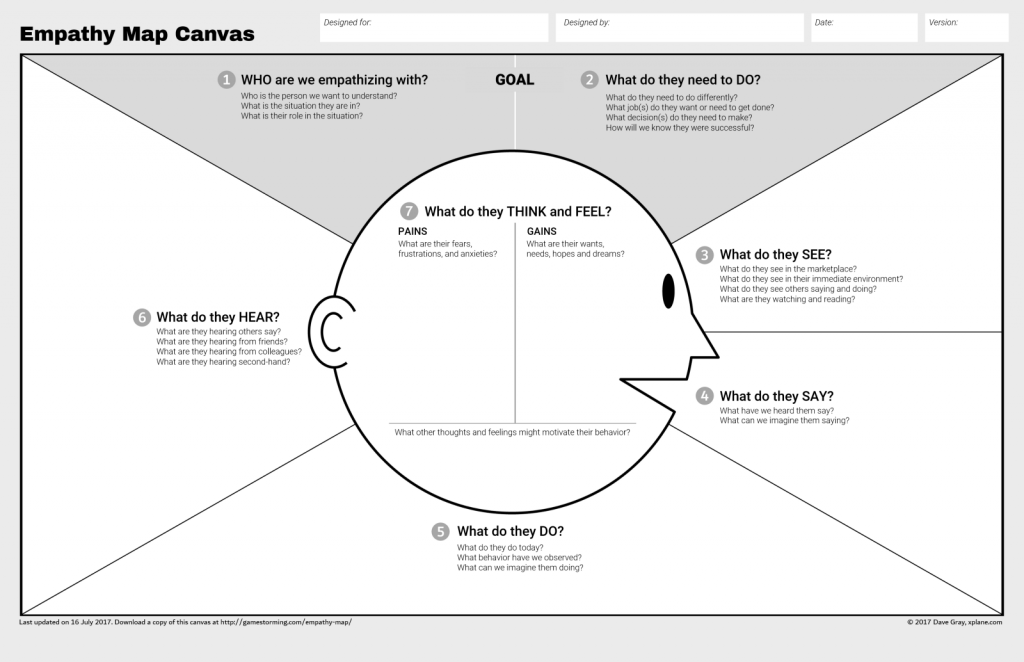
You can see that sections look a lot like what you would normally put inside your persona profile, so where's the catch?
Apart from the layout, the difference is that we focus on what happens "inside their head". In other words, instead of assessing the customer from the outside, we try to see the product the way the customer sees it. And hear what the customer hears. It's a different kind of perspective that produces different kinds of new insights.
You may also notice the numbers assigned to each field. The numbers tell you the order in which to fill out the map sections. And it's not just a convention - going step by step in that exact order ensures you will get a very authentic customer experience — just like your customer would.
Why empathy mapping? Benefits

The purpose of the customer empathy map is to put together all the bits of knowledge you already have about your customers, which you can sync later with the team. It can also give you some clues on why the existing product does not meet customer's expectations, as well as how to fix it.
Besides, insights that go into What they see and What they hear can be a nice input for marketing. You can get a better understanding of what sources influence your consumers and then think of potential marketing activities and partnerships.
If you are practicing client empathy mapping in a business domain that is new to you (e.g., drilling rigs), then collaborative brainstorming with a subject-matter expert will definitely give you a quick boost of domain-specific knowledge and verbiage. You may not even use the resulting map, but you’ll get a ton of insights that will benefit your further work.
Customer empathy mapping does exactly what its name promises — helps you build up empathy, and it offers a very clear and comprehensive layout. Plus, unlike personas, empathy maps give you a peek into your customers' heads with their inward approach.
On top of that, empathy maps are a little easier to create than personas. With personas, there are many other things you need to think of (such as demographics and goals). So, client empathy mapping is sort of a fast-food persona. Unlike fast food, it's actually good for you and your business.
Read also: Good Personas vs. Bad Personas.
You can build an empathy map for any product or service. And it doesn’t matter if it is an existing product or just a promising idea. The overall approach is simple:
- First, you need to outline your target audience.
- Set up a brainstorming session with your team and fill in sections one by one. Fill free to speculate and use your hypothesis for now — you’ll validate them later.
- Validate your assumptions. For instance, if you are building a project management tool, you will want to know how your users already managed projects in the past, what they liked or disliked about their existing solution, what other tools they used, etc. You can pick any user or customer research method you like for this purpose.
4 elements of an empathy map

An empathy map typically includes four main elements or sections:
Says
This section represents the explicit statements and quotes from the user. It includes what the user says about a particular situation, problem, or their customer journey in general. These can be interview quotes, for example. These statements provide direct insights into the user's thoughts and can help in understanding their perspective.
- Scenario: A user interacting with a mobile banking app.
Quote: "I wish the app had a feature to categorize my expenses. It's hard to track where my money is going each month."
- Scenario: An e-commerce website user struggling with the checkout process.
Quote: "The checkout page is confusing; I get nervous every time I have to enter my credit card details. It needs to be more straightforward."
Thinks
This element focuses on the thoughts and mental processes of the user or customer. It involves capturing beliefs, assumptions, and considerations. Understanding what the user or customer is thinking can provide valuable insights into their motivations and decision-making processes.
- Scenario: A first-time user exploring a language learning app.
Thought: "I hope this app can make learning a new language fun and not too overwhelming. I've tried other apps, but they felt too complicated."
- Scenario: An online shopper considering a high-priced item.
Thought: "I wonder if this expensive gadget is worth the investment. Are there any reviews that can help me make a decision?"
Feels
This section delves into the emotional aspects of the user or customer experience. It involves identifying and describing the customer's or user's emotions, such as joy, frustration, satisfaction, or anxiety. Recognizing the emotional responses of users can help design teams connect with their audience on a more personal level and deepen their design thinking skills.
- Scenario: A user completing a fitness app workout.
Emotion: "I feel accomplished and motivated after finishing a challenging workout. The app's encouragement really boosts my mood."
- Scenario: A frustrated user navigating a customer support portal.
Emotion: "Dealing with customer service shouldn't be this stressful. I'm annoyed that it's taking so long to find the information I need."

Does
This element represents the observable behaviors and actions of the user. The observation is accompanied by documenting what the user does in a given situation, including their actions, reactions, and interactions with products or services. Understanding user behaviors helps in designing solutions that align with their needs and preferences.
- Scenario: A user exploring a recipe app.
Action: "I always scroll through the pictures first. If the dish looks appealing, then I read the recipe. Visuals matter to me."
- Scenario: A user shopping for clothes on an e-commerce site.
Action: "I usually abandon my cart if the website takes too long to load. Speed is crucial for me when shopping online."
By considering these four elements together, teams can do comprehensive empathy mapping that provides a holistic view of the user experience or customer journey from its empathetic side. This, in turn, can guide the design and product development to better meet the needs and expectations of the target audience.
How to create an empathy map

Creating an empathy map is a collaborative process that brings together insights from team members to develop a holistic understanding of the user or customer experience. Below is a step-by-step guide on how to create an empathy map.
Define the purpose
Ask yourself why you need an empathy map and make sure everyone on your team agrees with that. For example, you are working on an app and want to build empathy with your potential customers.
Get to know your people
Dive into the specifics. Who is your user or persona? Are they tech-savvy millennials, busy parents, or maybe retirees exploring new hobbies? Understanding these details sets the stage for creating a design that truly fits their lives.
💡 If you're designing a travel app, knowing if your users are adventure seekers or relaxation enthusiasts can shape the kind of features they'd appreciate.
Have a chat
Be where your users are — online or offline. Ask questions that go beyond a simple yes or no. Dive into their daily routines, pain points, and joys. Collect not just data but stories that give you a real sense of their experiences.
💡 If you're designing a health app, hearing a user say, "I struggle to stay motivated to exercise after work," gives you a deeper insight than just knowing they exercise.
Organize the insights

Break down the information into clear categories. What are they explicitly saying (Says)? What's going on in their heads (Thinks)? How do they feel about it all (Feels)? And finally, what actions are they taking (Does)?
💡 For a food delivery app, 'Says' could be "I wish the app had more vegetarian options," while 'Does' might be "Usually order dinner for one."
Draw it out
Make it visual. Create a simple but information-rich map. Divide it into four basic sections or have more of those if needed (an example of an empathy map with multiple sections is in the last section of this blog post). This visual aid makes it easy for your team to absorb and contribute.
💡 Imagine a whiteboard split into four quadrants. In the 'Thinks' section, you might draw thought bubbles, and in 'Feels,' little emoticons representing various emotions.
Team huddle
Bring your crew together. This isn't a solo mission. Designers, developers, marketers — everyone has a unique perspective. Get them in a room or a virtual space and let the ideas flow.
💡 In a team discussion for a new messaging app, a developer might highlight the importance of quick loading times, while a designer might emphasize the need for an intuitive interface.
Stick it up
Use tangible tools like sticky notes or digital tools for virtual collaboration. Each team member adds their findings to the board. It's a colorful mosaic of insights.
💡 If you're working on a social media app, one sticky note might read, "Users often feel overwhelmed by too many notifications."
Chat it up

Make people up (optional)
Create fictional user personas based on collective insights. These personas represent different user types and help keep the team focused on designing for real people, not just statistics.
💡 If you're developing a finance app, create personas like "Budgeting Bob", who wants a simple way to track expenses, and "Investor Irene", who seeks in-depth financial analytics.
Fix and fiddle
Refine your board based on the team's discussion. Ensure it tells a cohesive story about your users. It's like polishing a rough gem until it shines.
💡 If your board reveals that users feel overwhelmed during the onboarding process of your app, consider refining it to be more user-friendly and guided.
Design with heart
Let your empathy map guide your design decisions. Keep the user's voice in mind as you create, ensuring your product addresses their real needs and concerns.
💡 If your map highlights that users value simplicity, design an interface that is clean and intuitive, avoiding unnecessary complexity.
Check with real people
Test your designs with actual users. Get their feedback and observe how they interact with your product. Use this real-world input to fine-tune both your empathy map and your designs.
💡 If testing reveals that users struggle to find a specific feature, consider adjusting its placement or providing clearer instructions based on the feedback.
Remember, this process is dynamic. Stay open to evolving your empathy map as you gain more insights, ensuring your design stays in tune with your users' ever-changing needs.
Empathy mapping tips

When it comes to filling in empathy map fields, here are some clues for you (feel free to use direct customer quotes):
- Who are we empathizing with? Collect facts about your customer. If, for example, you are creating a map for a Project Managing tool, ask yourself: What role do they have in the project? What are their responsibilities? How experienced are they?
- What do they need to do? Think about their goals. What do they try to achieve? What metrics can be used to measure if the goal is achieved?
- What are they seeing? What do their surroundings look like? What other options do they have for solving their issues? What interfaces are they used to? How do your competitors look at them? What ads do they see? Feel free to add imagery here.
- What are they saying? What opinions do they express about the subject? What do they post on LinkedIn and other social media?
- What do they do? How do they act in public? What conferences/events do they attend? What skills do they have?
- What do they hear? How do the surroundings affect users? What do their colleagues and influencers say? What media sources affect their behavior?
- Think and feel. That one can be split into three:
Pains: what worries them? What are they afraid of? What can be a reason for them to turn you down?
Gains: what can help to solve their problems? What can convince them you are the right choice? What pros of using your product or service are there? What smooths their experience with you?
Other thoughts: anything that didn’t fit into the previous two. What verbiage do they use in regard to the problem you are solving? These kinds of things can be hand-picked wherever people share their feedback: on forums, support logs, Facebook reviews, etc.
Looking for more expert tips? Check out our blog post about building empathy maps in the B2B domain.
Empathy Maps Builder in UXPressia
And guess what? Although our Personas Online Tool is called, well, personas, you can still create cool-looking empathy maps with it as well. Have a look:
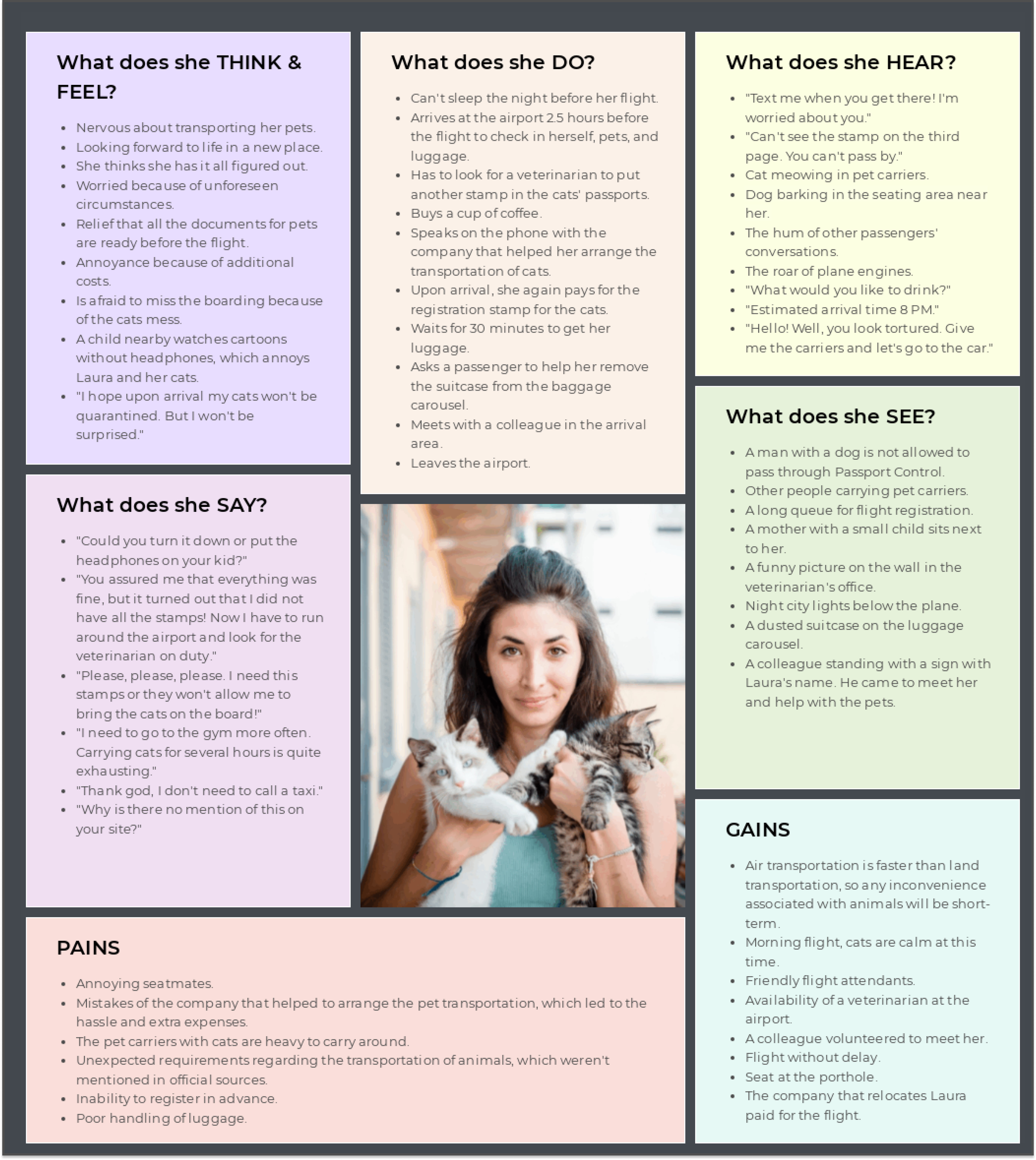
This is Laura. She is an engineer and recently found her dream job. The catch is that for this job, Laura needs to move to another country. And everything seems to be fine. She sold some things, sent the most necessary stuff by a transport company, and now she has to move herself and take two cats with her. As we know, international animal transportation can be very stressful. Perhaps you can imagine what Laura will go through, but just in case, we listed her experiences and adventures in this Air passenger empathy map template.
You can build a similar empathy map for your persona, playing with colors, fonts, and sections, or use this one above to adjust it to your case. Ready to start?
This is an updated version of the article that was first published in 2018.



Interesting concept. Feels like this would be easier to tackle than creating personas from scratch. I’m wondering if you have an empty empathy map template though, the one I can fill out myself based on your example?
Hi Liliana, you can find an empathy map editable template right here: https://uxpressia.com/templates/cx-business-tools.
It’s not completely empty: there are questions written inside the tiles to prompt your ideation. You can delete them as you fill out the template and replace with your own content.