No one initiates journey mapping for the sake of journey mapping. There is a long list of reasons why companies do this activity. Improving customer satisfaction scores, building customer loyalty, supporting new corporate initiatives, or building a new product — those are on the list.
But can’t just a simple Excel spreadsheet do the job? After all, it's all plain text, right? But let's ask ourselves — when we go to our favorite grocery store, which candy has more chances of being spotted out and ending up in our shopping cart: the one with well-designed packaging or the one in a gray wrapper?
Contents
- 1 When & how to add visuals
- 1.1 Case 1: Get into customers’ shoes
- 1.2 Case 2: Explaining improvement ideas
- 1.3 Case 3: Emphasizing extremes in the journey
- 1.4 Case 4: Explaining the process nature
- 1.5 Case 5: Explaining the interaction between several actors
- 1.6 Case 6: Backing up your journey with quantitative data
- 1.7 Case 7: Drawing attention to the most critical areas
We tend to give more attention to things that look good. Look at these two journey maps:
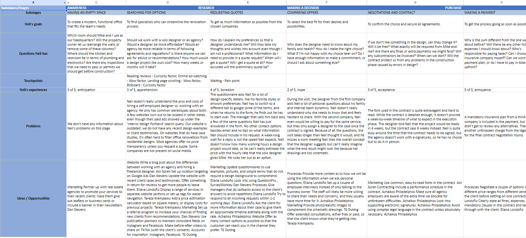
- Interior design customer journey visualized in a spreadsheet
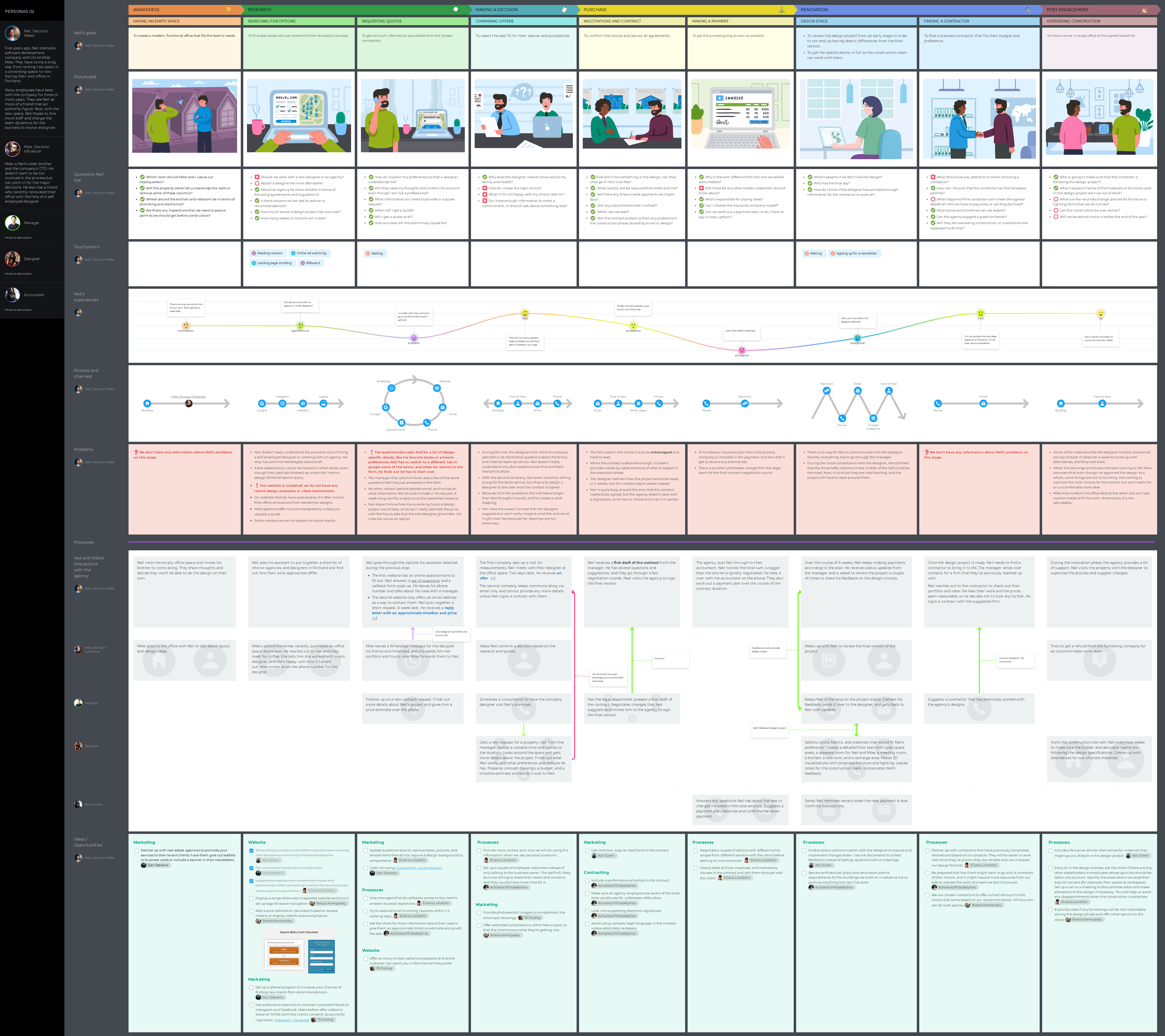
- The same journey is visualized with a professional mapping tool — UXPressia

Same content, different tools. Which one would you show your boss?
A clear and compelling map is a must for understanding the journey, barriers, and moments of truth. It will also sell your ideas more easily. And in this article, we'll equip you with simple tips on how to make your CJM more visual and impactful.
When & how to add visuals
There are a few cases where you should sprinkle your map with some good graphics. But don't think any picture will do as long as it's bright and fun. It has to be functional, not distracting. So, let's look at what visuals to use for each case.
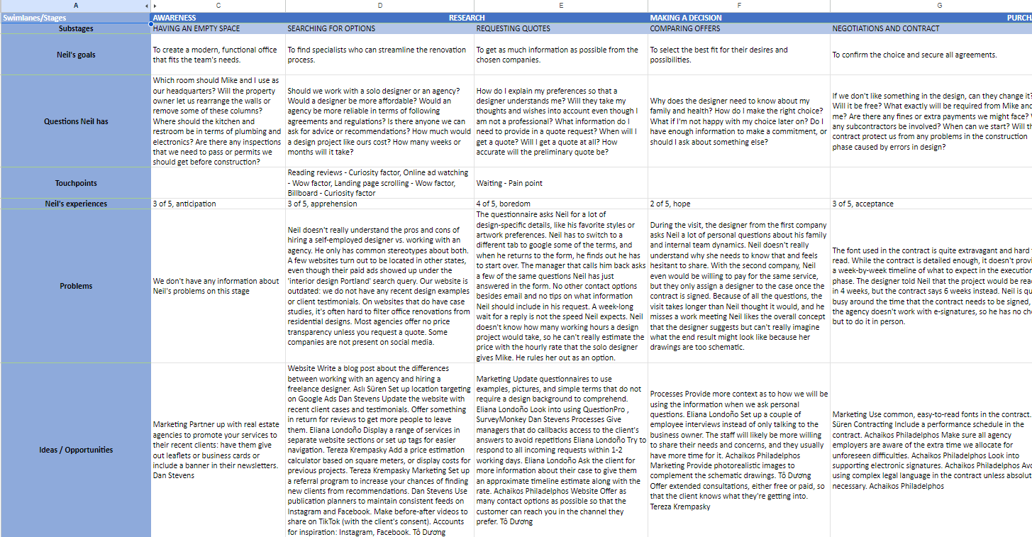
Case 1: Get into customers’ shoes
A customer journey map is not a process map — it’s all about empathy and looking at the service/product through the eyes of a customer. You want to see what the customer/user sees and perceives when going through the journey. In this case, images work miracles. Here’s what you can do.
If you are mapping a journey for a software product, add interface screenshots. If there are some triggered email notifications in between, add those, too.
Just seeing them next to each other one by one sometimes can give you some clues about user behavior. There are some good questions to ask yourself at this point:
- Are those making sense at all? Aren’t you asking users for a favor prior to giving something to them first?
- Are the steps predictable and clear?
- Are the overall tone of voice and visual design consistent throughout the journey?
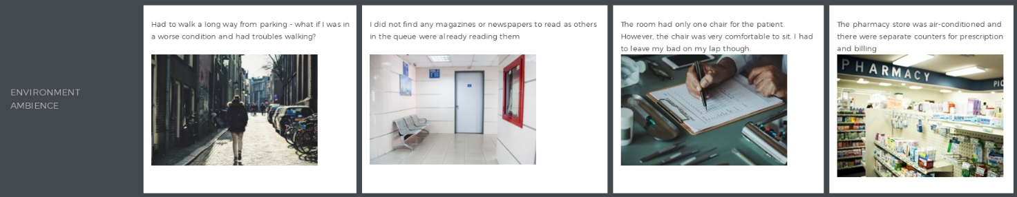
If you are dealing with a brick-and-mortar case, think about photos. Focus on the following:
- Do the customers have any trouble finding you? Is the navigation confusing? How about parking?
- What do they see around them? What impression does it make?
- Are they comfortable in the given context?
If you produce tangible goods, then you should definitely add photos of the packaging and the product itself. And not just products; it can be invoices, flyers, posters, business cards, ads, etc. As you are designing experiences, you must have the full picture of what impression those things produce on your customers, what emotions they invoke, and what unexpected effects they might have.
Tip: In UXPressia, you can generate real-life-like images for your specific customer journey.
It is unlikely that every employee involved in customer journey map discussions will have time to go through the same path customers take, and that’s ok. That's why you create the map — to give them a taste of what customers feel and to awaken empathy.
Note that all that’s stated above is also applicable on a touchpoint level:
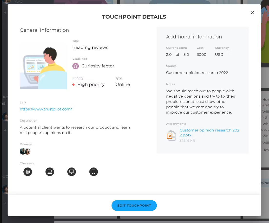
Learn more about UXPressia's Touchpoints library.Case 2: Explaining improvement ideas
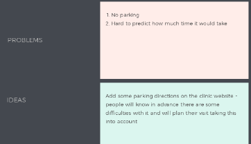
The best part of each customer journey map is when the team comes up with ideas on how to make things better for both the customers and the business. Now, the worst part is those ideas don't make it to production that often. When you capture them in plain text, chances are even higher that they will remain invisible and forgotten. So, how can we change it?
Show examples of how others approach the same problem. That will perform much better than a thousand words.

Add rough sketches of your suggestions. Those may cover the interface, for example, or the overall process (number of steps, their sequence). A quick sketch is easy to create and much easier to understand than a wordy description.
Case 3: Emphasizing extremes in the journey
To make effective decisions, you need to be able to identify the points of extremes — when a customer is delighted or, the opposite, extremely frustrated. You need the first one so you understand what works and make sure you keep it that way and don’t break accidentally during the transformation process. The latter needs to be easily identified so you can fix it as soon as possible, as those are the things that ruin your KPIs and cost the company money and reputation.
Good luck trying to do that with plain text. Use the experience graph instead — it will quickly show where your service fails to deliver an exceptional experience:

Feel free to add quotes from customer interviews that complement each emotion, as nothing speaks better than an angry or excited customer. Want to take it a notch further? Then, add a link to a public review. Seeing a screenshot of someone telling you about their experience somewhere on Facebook will also give your team a sense of what your customers actually feel. And also what others see when they go searching for reviews.
Read also: Setting up a library of reusable images in UXPressia.
Case 4: Explaining the process nature
Sometimes, showing the exact type of process on your map will help your team identify repeating and unnecessary steps. In other cases, it will help you see more clearly how people interact with your service at each stage, and this alone can give you an insight or two. Depending on the process type (e.g., linear, non-linear, or cyclic), you might want to focus on different things:
Linear processes imply there’s a set of required steps, one by one, customers should take. They can’t go from A to C without B. For those you might want to know:
- Is there a clear reason why each step is in place?
- Can you simplify the overall process and help customers get what they need sooner?
- Are any steps repeated unnecessarily? (for example, when the user has to enter some data more than once)
Non-linear processes give customers some freedom in going from A to C — the start/end points are known, but the sequence of actions can differ. Things to consider here:
- Is the route through the system clear to customers?
- Are there points where they’re unsure where to go next?
Cyclic processes are repeating from time to time. Besides the questions above (they are useful here, too), you should also think about the timing:
- How long does the whole process take?
- Are people satisfied with the overall timespan and with the time taken for individual steps?
Bi-directional processes showcase when one task leads to another, and the customer can return to the previous step.
- Consider if going back and forth between the steps is part of a normal process and not a necessary measure your customers must tolerate.
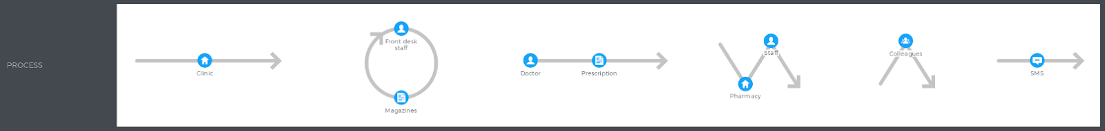
Adding some channel icons brings even more visualization and helps to figure out the process at a glance.
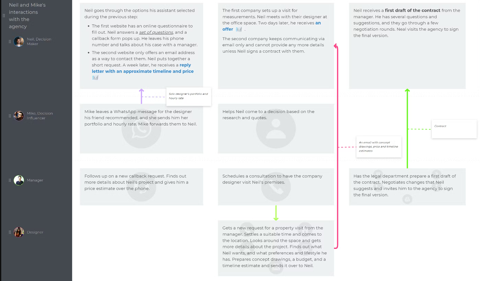
Case 5: Explaining the interaction between several actors
Oftentimes, your customer's journey implies active participation of other parties, be it your employees or even different customer types. For instance, you have drivers and passengers in services like Uber or property owners and guests for services like Airbnb.
These interactions might be challenging to grasp when looking at just a textual description, but adding some boxes and arrows can add more clarity:
Read also: Multiple personas on one journey map.
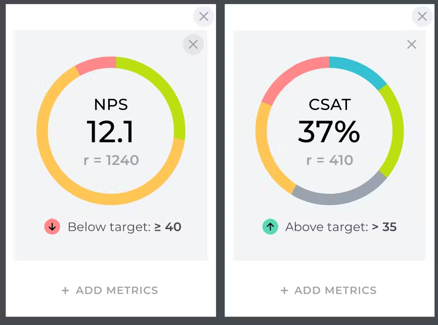
Case 6: Backing up your journey with quantitative data
It is especially important when you plan to share your journey maps with people who haven’t been actively participating in the mapping. Adding numbers will help you to prove the point and make the map findings more trustworthy. Besides, it will help to set up the priorities when you move to action planning.
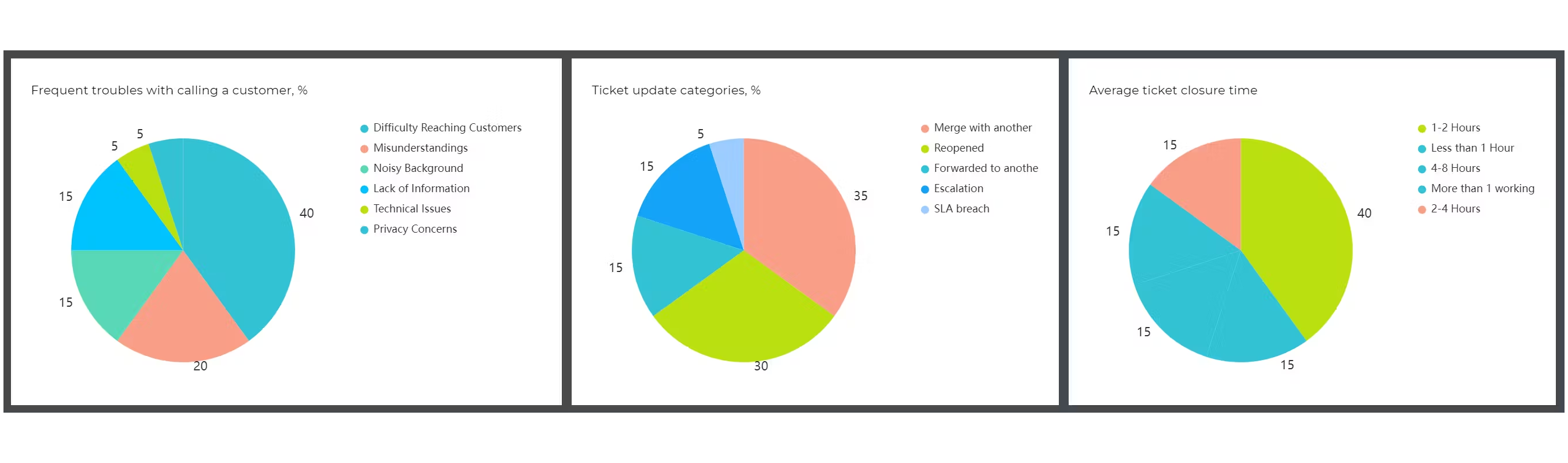

Adding actual KPIs will help explain the importance of your findings to the stakeholders.
Case 7: Drawing attention to the most critical areas
Designer or not, you still need to think about how the end document will be perceived by the people you’ll be presenting it to. Some things in the maps are more important to capture than others. So here are some design tips to make sure they don’t go unnoticed:
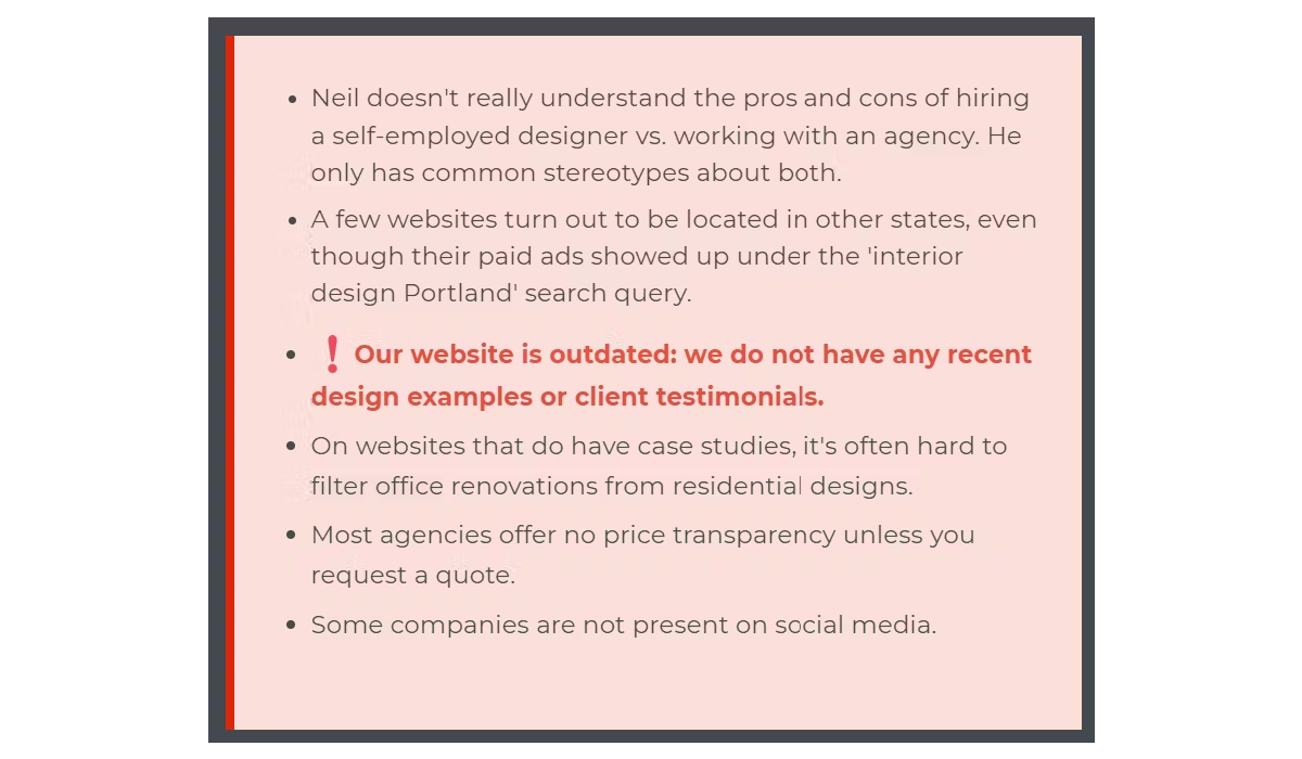
Use color-coding where appropriate. For example, red for the “bad” stuff, “yellow” for the warnings, and “green” for the good stuff. A cliché, but a working one:
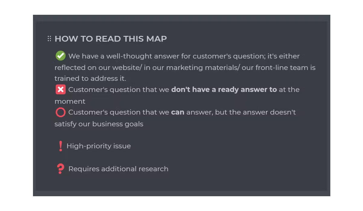
Consider using icons or special symbols to categorize different items or to add weight to some of them. Don’t forget to include a legend that would explain their meaning:
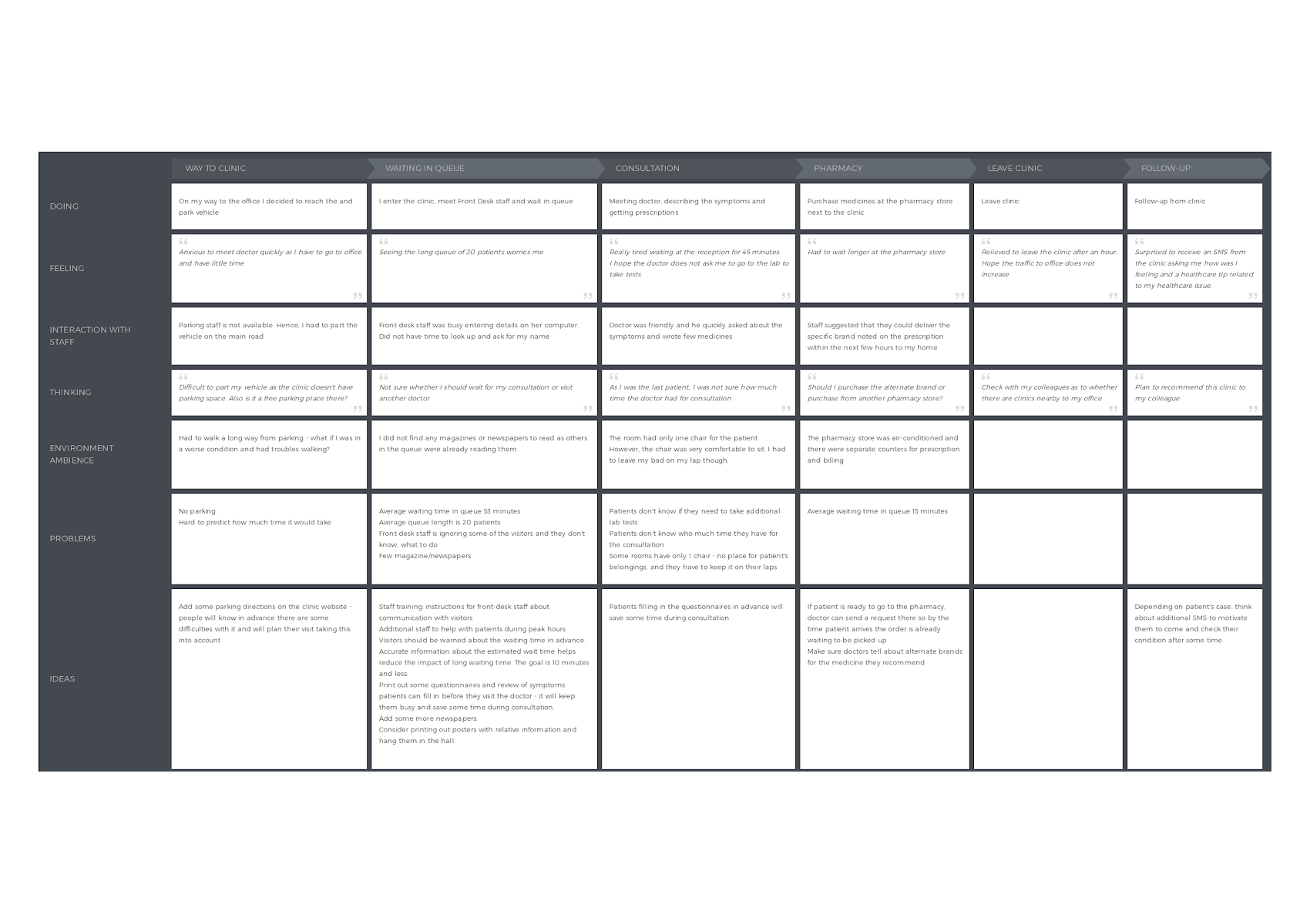
Use font hierarchy when it comes to the long texts (headers, subheaders, text formatting) — that way, it will be easier to scan and capture the key points:

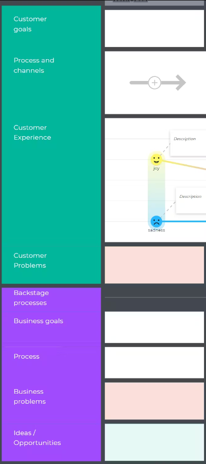
Use section colors and dividers to group swim lanes for complex maps:
The exact same map can look very different depending on how you visualize your ideas:
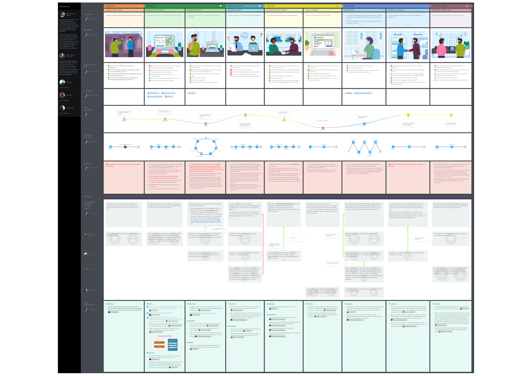
Which one would you show to your team? 😉
Adding visuals or not adding them is your choice after all, but whatever you decide in the end, keep in mind that at UXPressia, you will create your maps and personas in mere minutes without any graphic design skills whatsoever. So, if you need to visualize that journey map and the deadline was yesterday, hop aboard, sign up for a free account, and start mapping! We have all the necessary sections for images, videos, and anything you want to have on your map.
Now that you know how to make your map more visual, the ball is on your court.


